
I was on the Upper West Side, coming out of a hostel for an overpriced Starbucks coffee right on Broadway, at W 75th. I sat by the window for a while, looking down the massive street wondering how many buildings were in the area. That block is what this post is about. NAIP (National Agriculture Imagery Program), overture building footprints, the same buildings I was looking at, pulled as data instead.
First dev log on GeoAI based on what I found and what I’m still figuring out.
To give a brief overview, GeoAI is basically the application of machine learning techniques on data with a unique location. It could be static data, giving information about your favorite bagel shop or dynamic data like the location of the car bringing your uber eats.
There are two ways in which you can represent this data. First is the vector form, where you use x-y coordinates ( longitude and latitude) , for now we will ignore the z coordinate as we won’t be talking about LIDAR .The second form is the raster format which represents the data in the form of a cell or pixel.
Note : I used google colab for this because it’s the fastest to set up and it gives you free GPU computing units. Additionally GeoAI is an open-source Python package which also makes it very easy to use.
I started by drawing a rough boundary around the Starbucks and pulling the NAIP satellite tile for it, then downloading the overture building footprints for the same area.
Plotting them with leafmap should give you something like this :
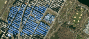
Now you can tap on any buildings in your area in real time and get all sorts of info such as building’s id, names, sources, level, height, number of floors, roof material, shape orientation, etc.
Furthermore you can pick any attribute and visualize the whole area on it :
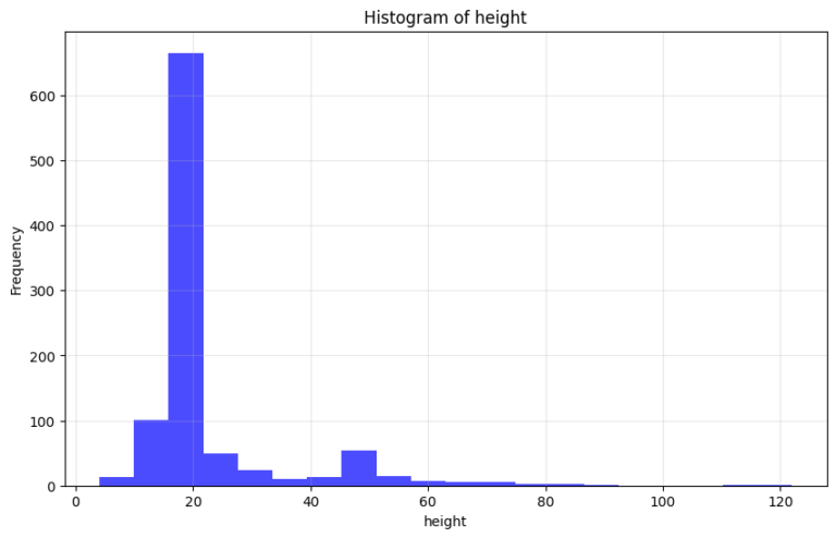
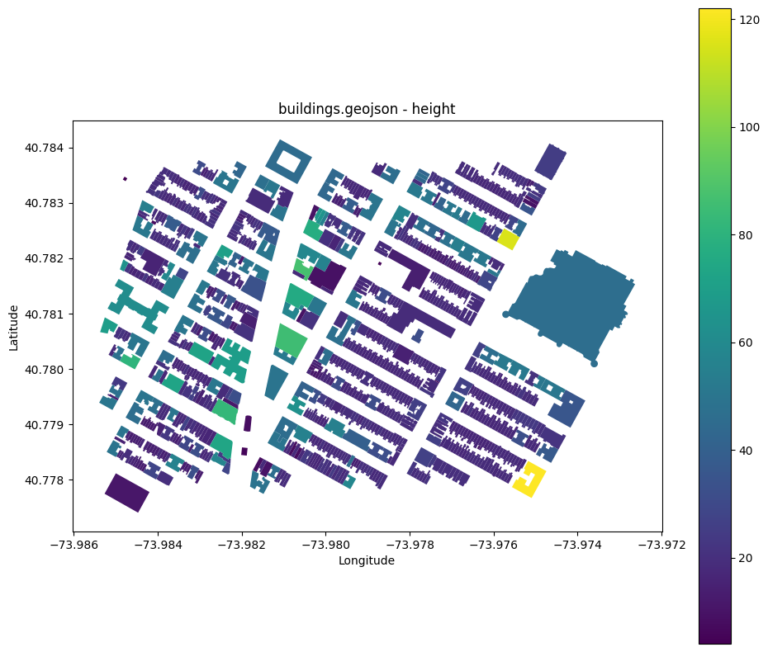
The graphs give you the height distribution of the buildings in the area which is pretty cool.
Out of the total 980 buildings we have the height data on 970 of them.
Shortest building : 4 m
Highest building : 122 m
Mean : 22.5
Median :18.2
So a handful of tall buildings are pulling the average up while most of the block sits shorter than what “mean” suggests.
I followed the same steps for the raster data and got back the entire island of Manhattan instead, not just my six blocks.
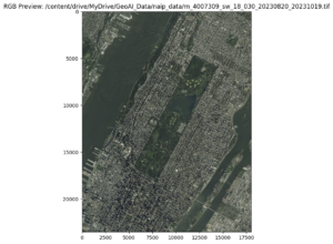
This is a GeoTIFF image, also a common raster format. It’s massive, we are talking 18,035 by 23,518 pixels, about 424 million pixels in a single image.
Fair warning, if you try doing deep learning on something this size on the free version of Colab, you will exhaust your GPU credits fast. I learned that one when I crashed my notebook.
Characteristics of the image :
First thing to note is the four bands. We have the usual red, green and blue you’d get from any photo, plus a fourth band for near infrared, the part of light your eyes can’t see but that plants reflect like crazy.
Then there’s the coordinate system, EPSG:26918, essentially the map’s ruler. Instead of latitude and longitude, it measures everything in flat meters.
And finally the band statistics, which are all about brightness. Min and max values between 0 and 255, which is the cap for 8-bit images. What’s interesting here is the band 4, the infrared one. Its standard deviation is 57.91, way higher than the other three bands. A rooftop and a patch of grass can look almost identical in red, green, and blue but in the infrared region they don’t agree at all.
This image however is too big and exceeds the boundary area. Easiest way to resolve the problem is to clip the raster data using the vector file’s own bounds as the crop. One thing to note is to make sure both files agree on the same coordinate system before you crop, otherwise the bounds don’t line up right.
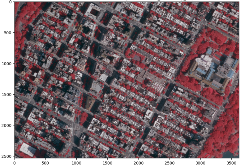
The final clipped version gave the neighborhood back in infrared because I also wanted to include the vegetation.
Now what can we do with all this information ? To find out stay tuned for next week’s GeoAI dev log.
For a deeper dive I would recommend you to go through https://book.opengeoai.org/ ( GeoAI with Python by Qiusheng Wu ).